
'%3e%3cpath%20d='M19%2028.5C19%2025.9804%2020.0009%2023.5641%2021.7825%2021.7825C23.5641%2020.0009%2025.9804%2019%2028.5%2019C31.0196%2019%2033.4359%2020.0009%2035.2175%2021.7825C36.9991%2023.5641%2038%2025.9804%2038%2028.5C38%2031.0196%2036.9991%2033.4359%2035.2175%2035.2175C33.4359%2036.9991%2031.0196%2038%2028.5%2038C25.9804%2038%2023.5641%2036.9991%2021.7825%2035.2175C20.0009%2033.4359%2019%2031.0196%2019%2028.5Z'%20fill='%231ABCFE'/%3e%3cpath%20d='M0%2047.5C0%2044.9804%201.00089%2042.5641%202.78249%2040.7825C4.56408%2039.0009%206.98044%2038%209.5%2038H19V47.5C19%2050.0196%2017.9991%2052.4359%2016.2175%2054.2175C14.4359%2055.9991%2012.0196%2057%209.5%2057C6.98044%2057%204.56408%2055.9991%202.78249%2054.2175C1.00089%2052.4359%200%2050.0196%200%2047.5H0Z'%20fill='%230ACF83'/%3e%3cpath%20d='M19%200V19H28.5C31.0196%2019%2033.4359%2017.9991%2035.2175%2016.2175C36.9991%2014.4359%2038%2012.0196%2038%209.5C38%206.98044%2036.9991%204.56408%2035.2175%202.78249C33.4359%201.00089%2031.0196%200%2028.5%200L19%200Z'%20fill='%23FF7262'/%3e%3cpath%20d='M0%209.5C0%2012.0196%201.00089%2014.4359%202.78249%2016.2175C4.56408%2017.9991%206.98044%2019%209.5%2019H19V0H9.5C6.98044%200%204.56408%201.00089%202.78249%202.78249C1.00089%204.56408%200%206.98044%200%209.5H0Z'%20fill='%23F24E1E'/%3e%3cpath%20d='M0%2028.5C0%2031.0196%201.00089%2033.4359%202.78249%2035.2175C4.56408%2036.9991%206.98044%2038%209.5%2038H19V19H9.5C6.98044%2019%204.56408%2020.0009%202.78249%2021.7825C1.00089%2023.5641%200%2025.9804%200%2028.5H0Z'%20fill='%23A259FF'/%3e%3c/g%3e%3cdefs%3e%3cclipPath%20id='clip0_1_137'%3e%3crect%20width='38'%20height='57'%20fill='white'/%3e%3c/clipPath%3e%3c/defs%3e%3c/svg%3e)


A floating label to explain additional context in the UI. They're triggered by interaction events like hover, focus, tap, or click.
Anatomy
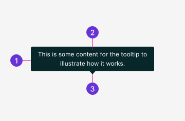
- Container: The Tooltip container is a floating overlay that houses its text content.
- Content: The Tooltip's main content provides more context to element it's attached to.
- Arrow: A directional indicator connecting the Tooltip to its trigger. Its placement depends on where the Tooltip opens.
Guidelines
Tooltips provide supplementary context about the element or workflow it's related to. Tooltip content should be informative and helpful but not serve as the primary source of information. Avoid redundant text.
When using the Tooltip, ensure it contains only static content. For more information on Tooltips and interactive elements, see Interactive Elements in Accessibility.
Tooltip vs Popover
Tooltips and Popovers both display content within a small, floating overlay. While similar, they are not interchangeable and each have their own separate use cases:
- Tooltips display short, non-interactive text intended to provide the user with additional context. They appear automatically on hover and focus and are dismissed when the user moves away.
- Popovers typically contain long-form content that may include interactive elements. By default, they require interaction to open but can be made to open on hover.
Best practices
Arrow usage
Keep the arrow visible to clearly associate the Tooltip with its trigger. This is especially helpful when multiple elements each have their own Tooltip.
Placement
Choose a placement that avoids obscuring related content. The Tooltip automatically repositions when it would overflow the viewport but starting with a thoughtful default reduces visual shifting.
Appearance
Arrow visibility
The arrow is displayed by default to visually connect the Tooltip to its trigger. The arrow can be hidden when the Tooltip's trigger association is evident.
The default arrow connects the Tooltip to its trigger.
Arrows may be removed for a cleaner look in denser layouts.
Trigger styles
When the Tooltip trigger must exist as inline text, we recommend using the underlined style to make the trigger more visually distinct.
The default trigger renders as inline text, blending with surrounding content.
An underlined trigger makes the interactive element more visually distinct within body text.
Behaviors
States
In its resting state, the trigger is interactive and the Tooltip overlay is hidden.
The Tooltip becomes visible when the user hovers over or focuses the trigger.
When disabled, the Tooltip will not display with the trigger is interacted with.
Animation
Tooltips animate in and out with a subtle fade and directional slide, where the direction matches the Tooltip's placement. The default transition duration is 125ms and can be customized with a component property.
Tooltips appear after a 250ms hover delay by default to prevent accidental activation during normal mouse movement. This delay can be adjusted as needed.
Positioning
Tooltips can be positioned on any side of their trigger. The position is not a guarantee—smaller viewports may cause the Tooltip to reposition as needed to remain visible to the user.
Bottom positioning is the default.
Positions the Tooltip above the trigger.
Positions the Tooltip to the right of the trigger.
Positions the Tooltip to the left of the trigger.
Tooltip groups
When using multiple Tooltips close together are placed within a Tooltip Group, they will share open and close animation timing and delay. When one Tooltip in the group is opened, others will open immediately when interacted with.
When one Tooltip in the group is already open, hovering another trigger opens it immediately without the usual delay.
Content
Tooltip content should describe what the element is or does. Write as a full sentence with a period in sentence case.
Rules
- One sentence
- Full sentence with period
- Sentence case
Length
Tooltips are intended to be short and informative. Limit content to short phrases or a single sentence. Longer content risks obstructing other elements in the UI.
If more information is needed, we recommend adding the content to the page directly or consider using the Popover component.
Icon-only buttons
When using tooltips on icon-only buttons, describe the action the button performs.
Sentence case
For short phrases or descriptions, write Tooltip text in sentence case.