
TextField
'%3e%3cpath%20d='M19%2028.5C19%2025.9804%2020.0009%2023.5641%2021.7825%2021.7825C23.5641%2020.0009%2025.9804%2019%2028.5%2019C31.0196%2019%2033.4359%2020.0009%2035.2175%2021.7825C36.9991%2023.5641%2038%2025.9804%2038%2028.5C38%2031.0196%2036.9991%2033.4359%2035.2175%2035.2175C33.4359%2036.9991%2031.0196%2038%2028.5%2038C25.9804%2038%2023.5641%2036.9991%2021.7825%2035.2175C20.0009%2033.4359%2019%2031.0196%2019%2028.5Z'%20fill='%231ABCFE'/%3e%3cpath%20d='M0%2047.5C0%2044.9804%201.00089%2042.5641%202.78249%2040.7825C4.56408%2039.0009%206.98044%2038%209.5%2038H19V47.5C19%2050.0196%2017.9991%2052.4359%2016.2175%2054.2175C14.4359%2055.9991%2012.0196%2057%209.5%2057C6.98044%2057%204.56408%2055.9991%202.78249%2054.2175C1.00089%2052.4359%200%2050.0196%200%2047.5H0Z'%20fill='%230ACF83'/%3e%3cpath%20d='M19%200V19H28.5C31.0196%2019%2033.4359%2017.9991%2035.2175%2016.2175C36.9991%2014.4359%2038%2012.0196%2038%209.5C38%206.98044%2036.9991%204.56408%2035.2175%202.78249C33.4359%201.00089%2031.0196%200%2028.5%200L19%200Z'%20fill='%23FF7262'/%3e%3cpath%20d='M0%209.5C0%2012.0196%201.00089%2014.4359%202.78249%2016.2175C4.56408%2017.9991%206.98044%2019%209.5%2019H19V0H9.5C6.98044%200%204.56408%201.00089%202.78249%202.78249C1.00089%204.56408%200%206.98044%200%209.5H0Z'%20fill='%23F24E1E'/%3e%3cpath%20d='M0%2028.5C0%2031.0196%201.00089%2033.4359%202.78249%2035.2175C4.56408%2036.9991%206.98044%2038%209.5%2038H19V19H9.5C6.98044%2019%204.56408%2020.0009%202.78249%2021.7825C1.00089%2023.5641%200%2025.9804%200%2028.5H0Z'%20fill='%23A259FF'/%3e%3c/g%3e%3cdefs%3e%3cclipPath%20id='clip0_1_137'%3e%3crect%20width='38'%20height='57'%20fill='white'/%3e%3c/clipPath%3e%3c/defs%3e%3c/svg%3e) Figma
Figma Github
 Storybook
A styled text input field.
Anatomy
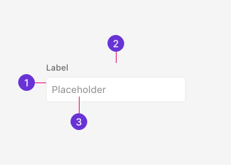
- Container: Outer wrapper that contains the label, input and assistive text.
- Label: Describes the purpose of the TextField. Accepts rich content like icons or tooltips.
- Field: Accepts user's freeform text input.
Guidelines
Choosing a form control
Text fields are the most common form control type to accept user input. They are primarily used for short, freeform text. There are Pluma components similar to the TextField that also accept freeform text, so it's important to understand the key differences to make the most appropriate choice.
- JsonFields are used specifically to validate JSON input within a textarea.
- Search is a specialized TextField tailored for searching.
- TextAreas are best for longer, multi-line text such as descriptions or messages.
- TextFields are used for freeform text to enter short, basic data such as names or email addresses.
Best practices
Labels and placeholders
While not explicitly required, we highly recommend providing a visible label so users understand the purpose of the TextField at a glance. If visible labels aren't possible or needed, be sure to provide an accessible label.
For more information on placeholders and accessibility, see Placeholders under the Accessibility tab.
Types
The default TextField is most suitable for names, emails, and other short-form text.
Password fields mask user input by default and include a toggle button to unmask and mask as needed.
Customization
In adhering with Pluma's focus on flexibility, the TextField component includes customization options beyond plain text. Customization is useful for adding richer label content or building custom assistive text.
Custom description
Descriptions are assistive text that display below the field. They can accept rich content including links.
A description with an inline link directs users to additional resources.
Custom label
The label accepts rich content, allowing you to include supplementary elements such as icons or optional indicators alongside the label text.
Icons can be used to reinforce the label's meaning.
Supplementary text clarifies that the field is not required.
Custom error
Error messages are assistive text that display below the field. They accept rich content, allowing you to include links or formatted text that better help users resolve the issue.
An error message with a link directs users to relevant documentation or support.
Appearance
Sizes
TextFields are available in two sizes: medium and small. Medium is the default.
Medium is suitable for most use cases.
Small is suitable for dense layouts and smaller viewports.
Icon
An icon can be used to emphasize visual meaning of the TextField, such as denoting search functionality.
Leading icons are displayed to the left of the field text.
Behaviors
States
The TextField has default input styling in its base resting state.
Border color updates on mouse hover to signal the field is interactive.
On keyboard focus, the field receives the standard 2px focus ring and the border color updates.
Active styles apply when the user interacts with the field.
Disabled fields cannot be interacted with. Background and text color update to indicate the field is unavailable.
A spinner displays inside the field to indicate a background job is in progress.
The TextField adopts danger styling to indicate there's an error. An error message displays below the field when set.
Clear button
A clear button can be enabled to reset the field to its initial empty state. The button is hidden when the field is empty.
The clear button resets the field.
Password visibility
Password fields include a toggle icon to unmask or mask user input. The toggle icon updates to reflect the current visibility state.
Password characters are masked by default.
Content
Assistive text
Assistive text displays below the TextField and gives the user information about the form field they're interacting with. Assistive text comes in different forms including descriptions and error text.
Description
Use description text to provide hints, formatting guidance, or constraints that help users enter the correct data. Short, complete sentences are preferred.
Error
Frame validation errors as direct instructions, not accusations. Never use "Please".
Rules
- Use short, complete sentences
- Frame as instructions, not prohibitions
- Place inline adjacent to the field
Labels
Write clear, concise labels that describe the data the TextField expects. Nouns and noun phrases are preferred.
Placeholders
Placeholders help the user complete a field by describing what information it expects or how it should be formatted. For most TextField use cases, we recommend leaving the placeholder empty. A blank field is easier for a user to see that it must be filled before submission.
Rules
- Short noun phrase or example value
- Sentence case
- No "Please" or "Enter your…"
- No period
- Use
e.g.for example values