
'%3e%3cpath%20d='M19%2028.5C19%2025.9804%2020.0009%2023.5641%2021.7825%2021.7825C23.5641%2020.0009%2025.9804%2019%2028.5%2019C31.0196%2019%2033.4359%2020.0009%2035.2175%2021.7825C36.9991%2023.5641%2038%2025.9804%2038%2028.5C38%2031.0196%2036.9991%2033.4359%2035.2175%2035.2175C33.4359%2036.9991%2031.0196%2038%2028.5%2038C25.9804%2038%2023.5641%2036.9991%2021.7825%2035.2175C20.0009%2033.4359%2019%2031.0196%2019%2028.5Z'%20fill='%231ABCFE'/%3e%3cpath%20d='M0%2047.5C0%2044.9804%201.00089%2042.5641%202.78249%2040.7825C4.56408%2039.0009%206.98044%2038%209.5%2038H19V47.5C19%2050.0196%2017.9991%2052.4359%2016.2175%2054.2175C14.4359%2055.9991%2012.0196%2057%209.5%2057C6.98044%2057%204.56408%2055.9991%202.78249%2054.2175C1.00089%2052.4359%200%2050.0196%200%2047.5H0Z'%20fill='%230ACF83'/%3e%3cpath%20d='M19%200V19H28.5C31.0196%2019%2033.4359%2017.9991%2035.2175%2016.2175C36.9991%2014.4359%2038%2012.0196%2038%209.5C38%206.98044%2036.9991%204.56408%2035.2175%202.78249C33.4359%201.00089%2031.0196%200%2028.5%200L19%200Z'%20fill='%23FF7262'/%3e%3cpath%20d='M0%209.5C0%2012.0196%201.00089%2014.4359%202.78249%2016.2175C4.56408%2017.9991%206.98044%2019%209.5%2019H19V0H9.5C6.98044%200%204.56408%201.00089%202.78249%202.78249C1.00089%204.56408%200%206.98044%200%209.5H0Z'%20fill='%23F24E1E'/%3e%3cpath%20d='M0%2028.5C0%2031.0196%201.00089%2033.4359%202.78249%2035.2175C4.56408%2036.9991%206.98044%2038%209.5%2038H19V19H9.5C6.98044%2019%204.56408%2020.0009%202.78249%2021.7825C1.00089%2023.5641%200%2025.9804%200%2028.5H0Z'%20fill='%23A259FF'/%3e%3c/g%3e%3cdefs%3e%3cclipPath%20id='clip0_1_137'%3e%3crect%20width='38'%20height='57'%20fill='white'/%3e%3c/clipPath%3e%3c/defs%3e%3c/svg%3e)


Labels are read-only indicators used to communicate a category, metadata, or process's current state.
Anatomy
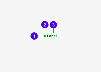
- Container: Provides the background color and border styles.
- Status indicator (optional): A colored dot that indicates the Label is being used to describe a status.
- Text: Provides contextual meaning in tandem with the background color.
Guidelines
Label vs Badge
Labels and Badges both convey information in visually similar ways but are not interchangeable:
- Labels emphasize status or categorize an item with words, such as "Active" or "Draft."
- Badges display the quantity of an item with a numeric value, such as showing how many notifications a user has.
Label vs Tag
Labels and Tags share visual similarities that may be easily misconstrued. Be sure to understand the fundamental difference between them as they are not interchangeable:
- Labels are read-only indicators set by the system or application. Users have no direct control over their creation.
- Tags may be user-generated and interactive. Users create them for categorization and filtering and can edit or remove them as needed.
Best practices
Color use
Color can be helpful for conveying meaning to users when used with descriptive text. Labels include a range of colors available for use. When using color, be consistent with their usage across the app. Avoid using color purely for decoration to fit a particular color scheme.
For more information regarding color and accessibility, see Color and meaning.
Status indicators
Status indicators are small dots added before the Label's text to visually emphasize a process's current status.
Labels can only become status indicators using the following common status colors:
- Red: Critical, destructive, not functioning
- Yellow: Warning or caution
- Green: Success, confirmation, or functional
- Blue: Info
- Grey: Neutral
Appearance
Variants
When deciding what Label variant to use, consider what versus where. Each available variant solves a particular use case.
- Base Labels have no status indicator dot. They're intended to be used for categorical attributes, that is, an attribute that describes what something is. Stables properties such as types, tiers, roles, tags, etc. fall into this category.
- Status Labels include the status indicator dot. They're intended to be used for operational status. An operational status describes where something is in its lifecycle and represents a live, mutable state. "Online/offline," "running/scheduled/stopped," and "active/draft" are all examples that fall into this category.
Default Labels are used for categorization and metadata to describe what something is.
Status Labels include a colored dot to communicate process states like success, failure, warning, or neutral to describe where something is in its lifecycle.
Colors
Labels are available in a range of colors. The default is grey.
Use the best Label color for a given status or semantic use case.
Font weight
Label text is bold by default for readability and emphasis. Use a lighter font weight for cases where the Label should be less visually prominent. Light text is not compatible with status indicators.
Bold text provides the strongest visual emphasis and is the default for most use cases.
Light text is less prominent and is used when emphasis isn't required.
Content
It's important to accurately and concisely describe the category or status using the Label. Use sentence case, but avoid full sentences and verbs. One to two words without punctuation is preferred.